Scaling a meal kit subscription service
Blue Apron
End-to-End Experience
Project Type
Web, iOS, Android
Platform
2018 – 2024
Timeline
Director, Product Design
Role
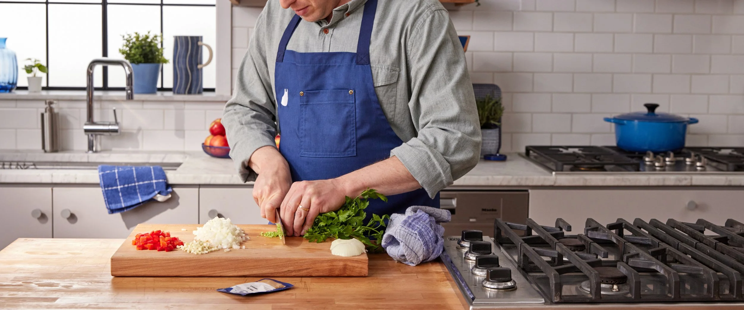
During my six years at Blue Apron, I served as a key decision maker and product leader, guiding the design of our website, mobile apps, and end-to-end customer experience. I led the launch of multiple new product lines, guided the regular expansion of our weekly menu, and implemented many new features and operational improvements. These initiatives gave customers more control and flexibility, making it easier for them to manage and enjoy their meal subscriptions.
Leading and mentoring a talented design team was another highlight of my time at Blue Apron. Together, we empowered our users while strategically supporting the business and championing informed, user-centric decision making. Shipping weekly boxes of recipes and ingredients may seem straightforward, but it involves plenty of complex challenges that require a deep understanding of our customers, the business, and its operations. Navigating limited design and engineering resources was another defining aspect of my role. We overcame these constraints by focusing on cross-platform consistency and operational efficiency, and by building strong partnerships across the company. This ensured every improvement was both impactful and scalable—work I’m deeply proud of for its lasting impact on both our customers and the organization.
User Growth
Growing our customer base required laser focus on efficiently acquiring new customers and making sure we’re doing everything we can to retain our existing community of home chefs.
Key KPIs: sign up conversion, bounce rate, cost of acquisition, customer count, churn, average customer lifetime

Making landing pages more performant
While landing page ownership fell under our marketing team, our team was regularly pulled in to consult and provide feedback on landing pages as they were being developed to make suggestions on how to increase conversion rates.

Polishing our App Store presence
For many users app stores are the first step in their journey to becoming one of our home cooks. My team took initiative to overhaul and update our assets and copy to make sure our offering was clear and compelling.
Constantly improving sign-up
With dozens of tests run every year, the sign up flow was the most heavily tested portion of our website. We tested everything from copy adjustments, the use of photos versus illustrations, and promo banner sizes, colors, and placements, to the order of steps, how and what kinds of preferences were offered, and how users entered the flow. No stone was left unturned on this collaborative multi-team pursuit of increasing customer count while balancing cost of acquisition.
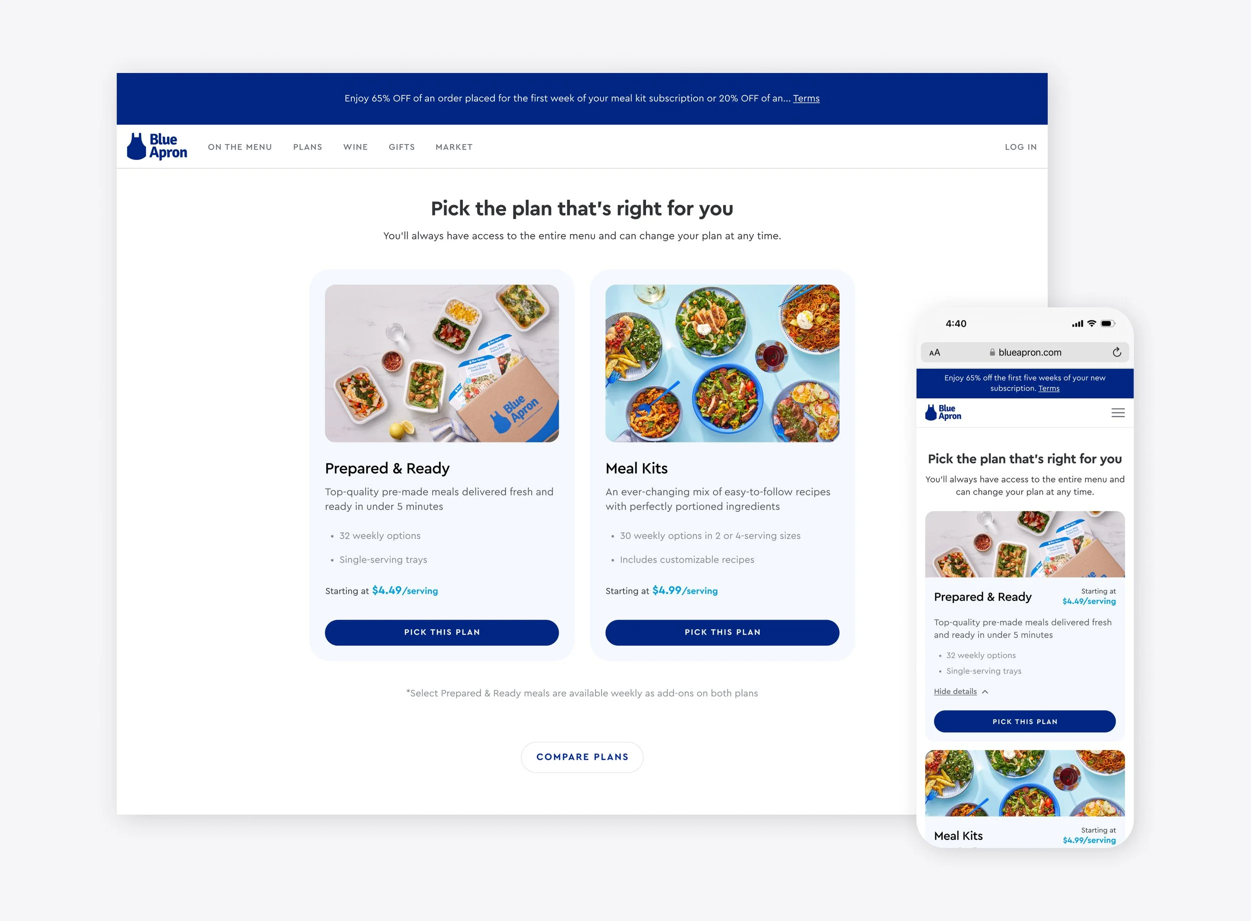
1. As our product offering expanded, plan building became more and more involved. This design tests if selecting a product type first would increase sign ups through clearer product comparison and education, and through shifting additional customizations to a subsequent step.
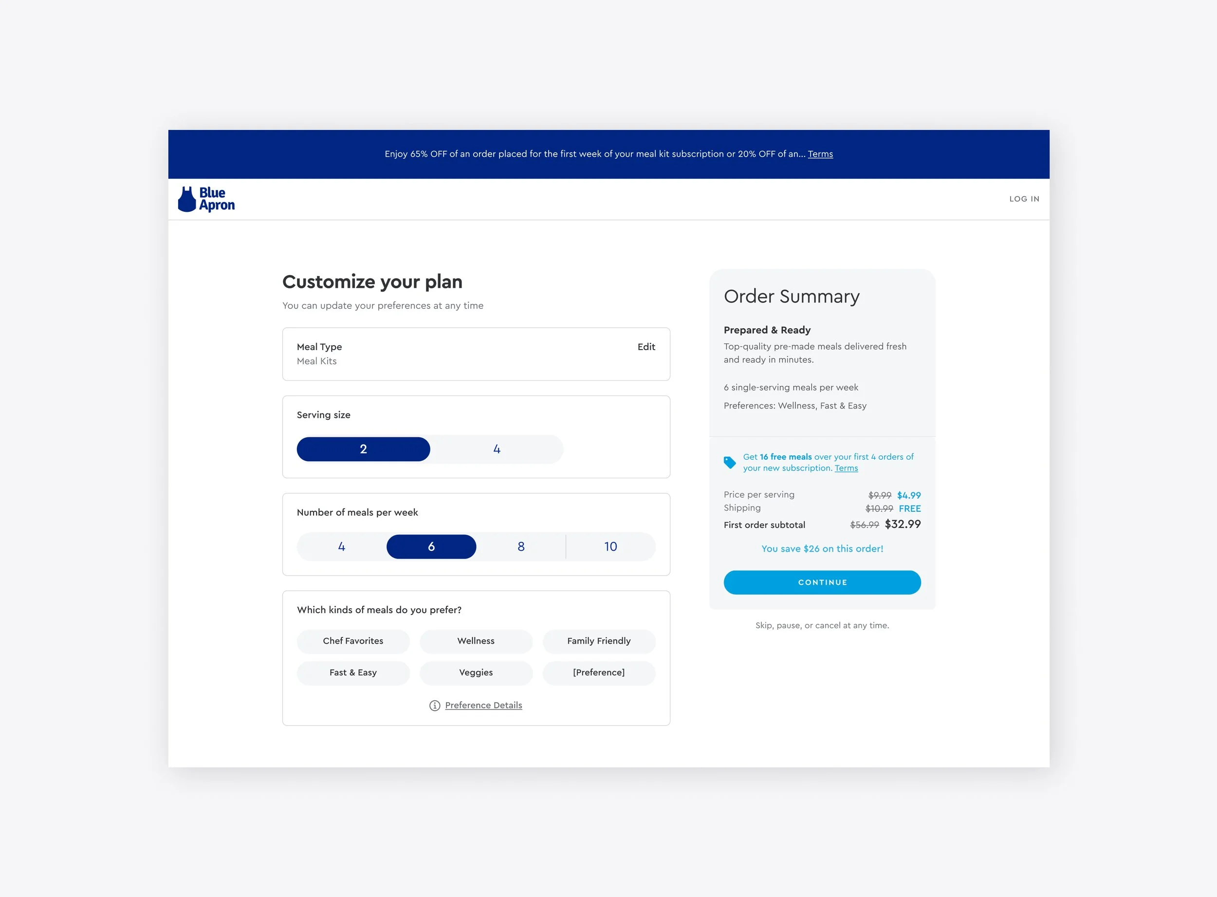
2. Plan customization is a moment of play where potential customers get to make their subscription their own. This design explored a simplified and more linear structure to the page as well as more prominent messaging around promotions and discounts.
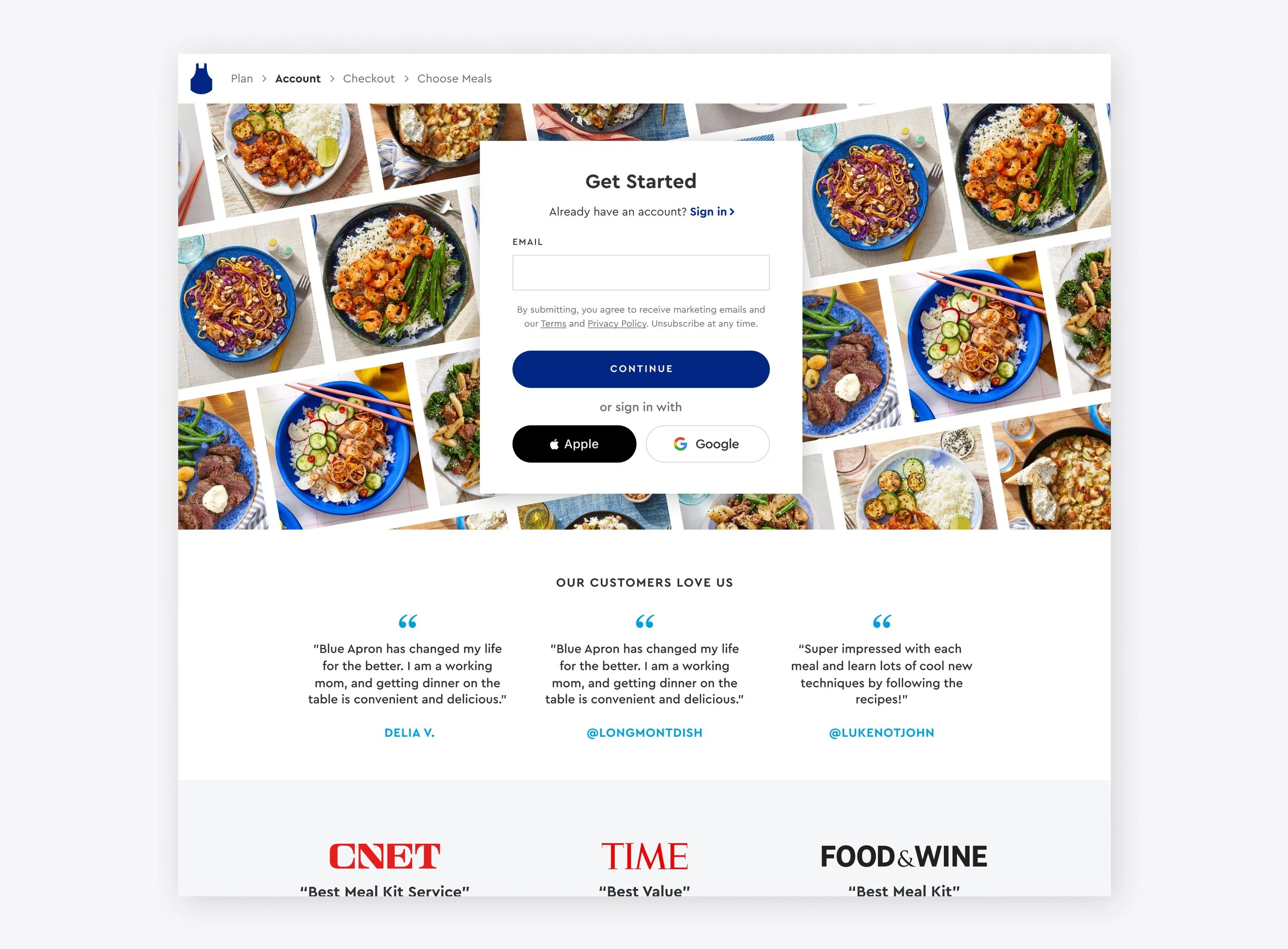
3. Account creation happening after plan building lets users explore their options before committing to use the service. Common testing themes for this page centered around the use of visuals, and integration of social proof through accolades, awards, and customer quotes.

Making our apps more welcoming
A full overhaul of our app landing experience now presents visitors with a simpler and more compelling welcome moment. It also finally unified Android, iOS, and iPadOS streamlining our design, engineering, asset production, and testing needs.

Effortless in-app sign-up
Compared to the previous utilization of a web view, introducing native in-app registration allowed us to create a more seamless and performant experience that increased conversion and better featured Apple Pay/Google Pay, & SSO and later onboarded a new payments partner accepting a wider range of payment options.
Making free trials easier to share
Happy customers are powerful product advocates but our research found that our existing email based system was too limiting because many customers didn’t know their friends’ email addresses. Advocating for new engineering capabilities resulted in the switch to unique invite urls that can be shared any way the user wishes. Our multi-phased design overhaul also resulted in a consistent experience across Android, iOS, and web, brought us into compliance for nearing regulatory changes, and resulted in a 30% increase in invites sent and a 70% increase in registrations.
Retaining customers with cancellation alternatives
Growing a customer base is just as much about attracting new customers as it is about retaining your existing customers. With increases in cancellation in the summer and the holidays we saw an opportunity to let users temporarily pause their deliveries and later return instead of cancelling their subscriptions. Life isn’t always perfectly routine and building in this flexibility decreased cancellation rates by nearly 14%.
Welcoming back previous customers
As our product offering expanded and we continued to introduce new subscription capabilities, we partnered with our marketing team to really lean into winning back customers that had previously tried our service but left for a variety of reasons. To complement those campaigns we revisited our reactivation flow highlighting the variety of new plans we’d added since they left and integrating promos that could be used to encourage customers to give us another try.
Path to Purchase
One of our team’s main missions was providing our community of chefs with the best way to pick their meals and manage their orders whether they were at home or on the go.
Key KPIs: order rate, average order value, skip rate, lifetime value, servings per order, menu engagement, upsell attach
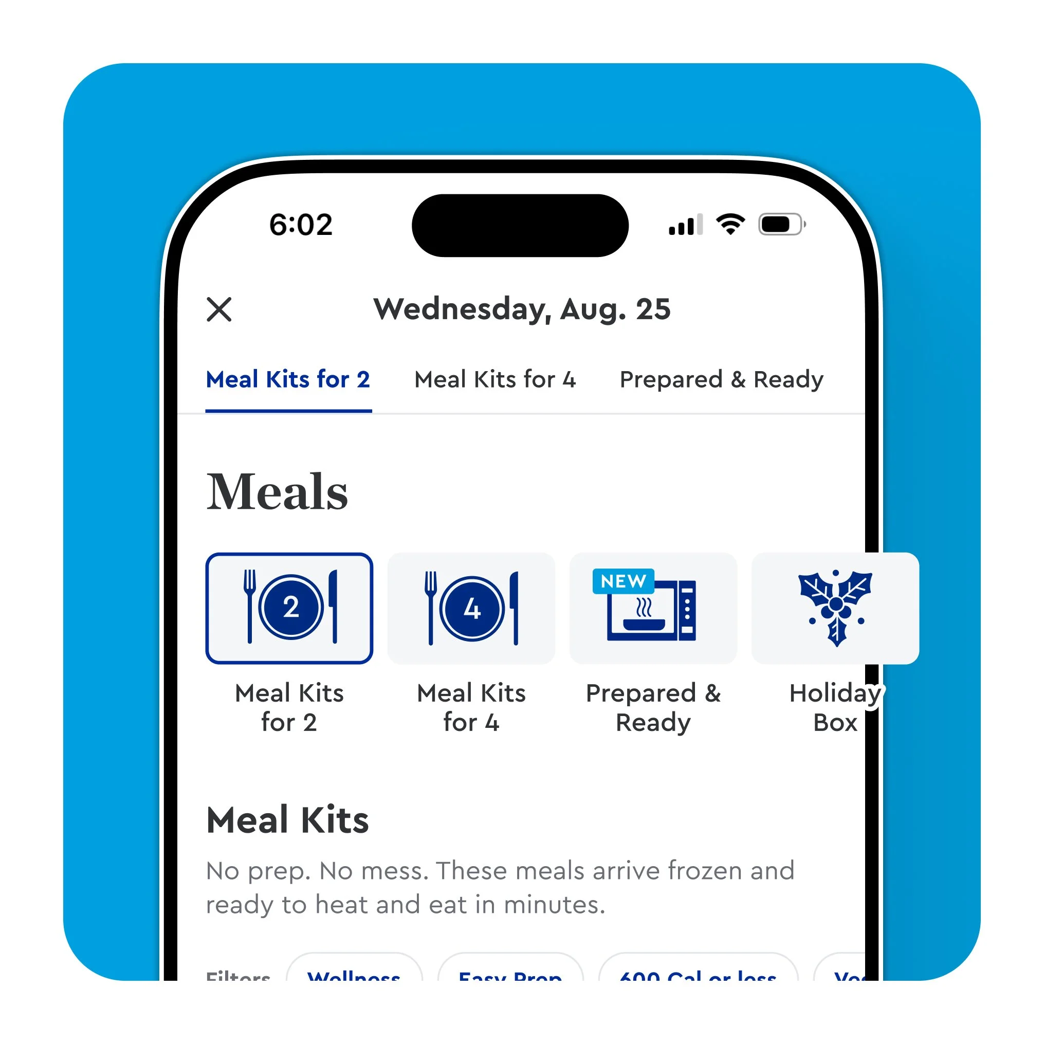
A new and improved ordering experience
Launching a fully reimagined menu experience was one of our biggest undertakings as a team and the one I’m most proud of. Leveraging years of customer insights, extensive exploration, iteration, prototyping and user testing, we were able to greatly improve the core path-to-purchase flow resulting in a 200% increase in menu engagement and a $3 increase in average order value during A/B testing.
Pairing graphics with our menu tabs increased awareness of and engagement with other sections of our weekly menu offering.
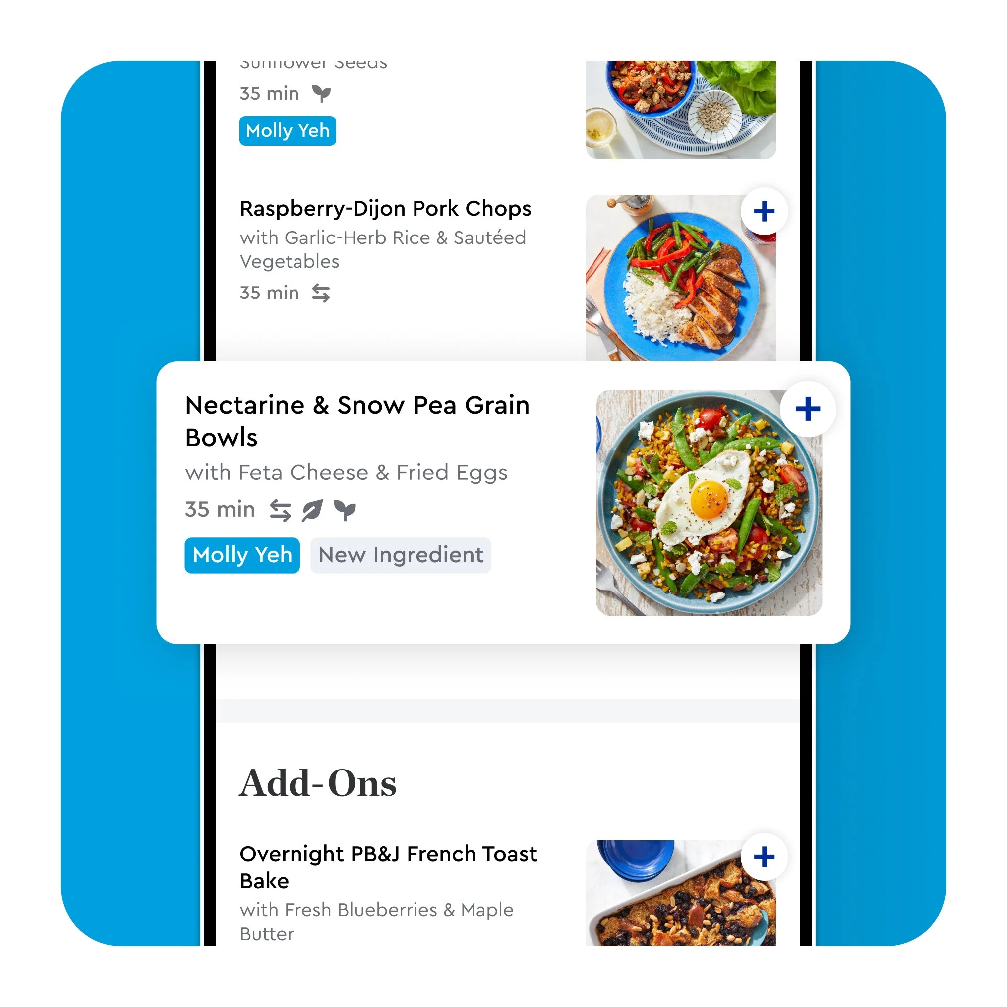
New vertically scrolling product cards make browsing easier and create a natural flow into other sections increasing order sizes.
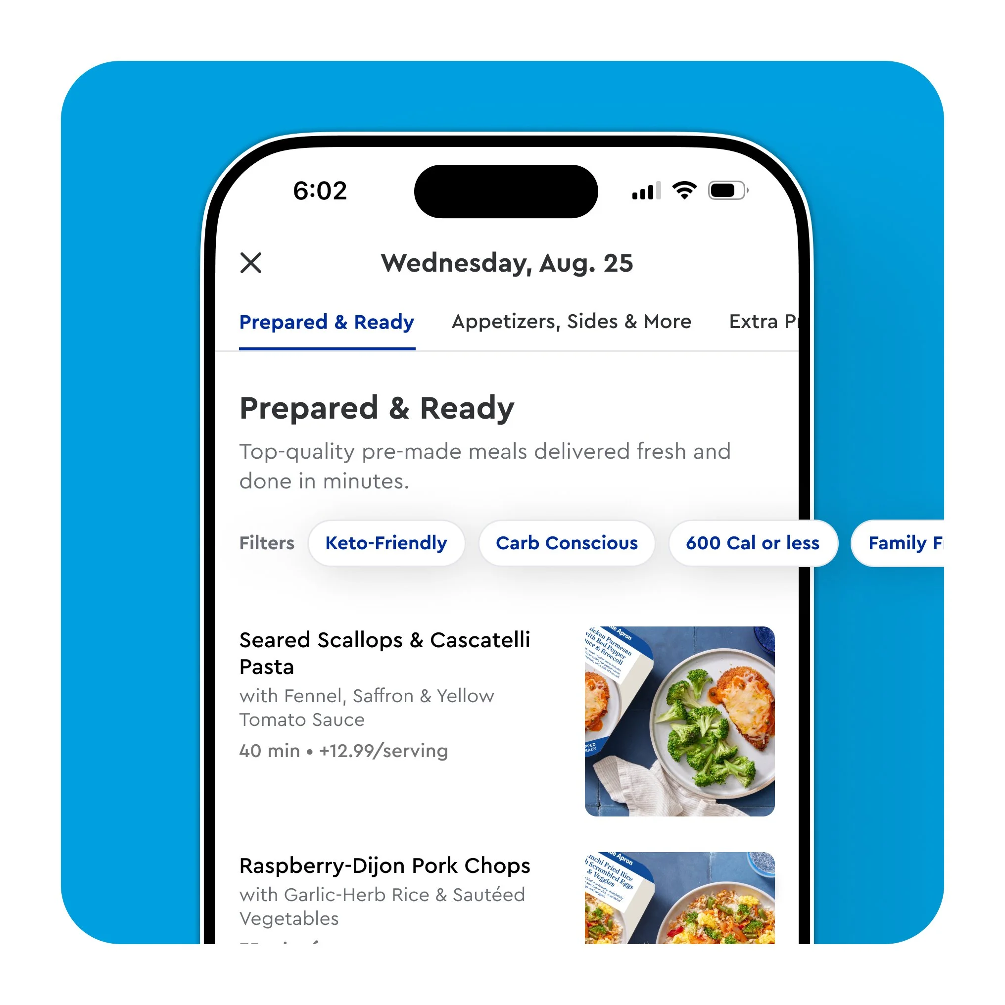
Quick filters help users find the meals that align with their weekly needs, increasing order sizes and decreasing skip rates.
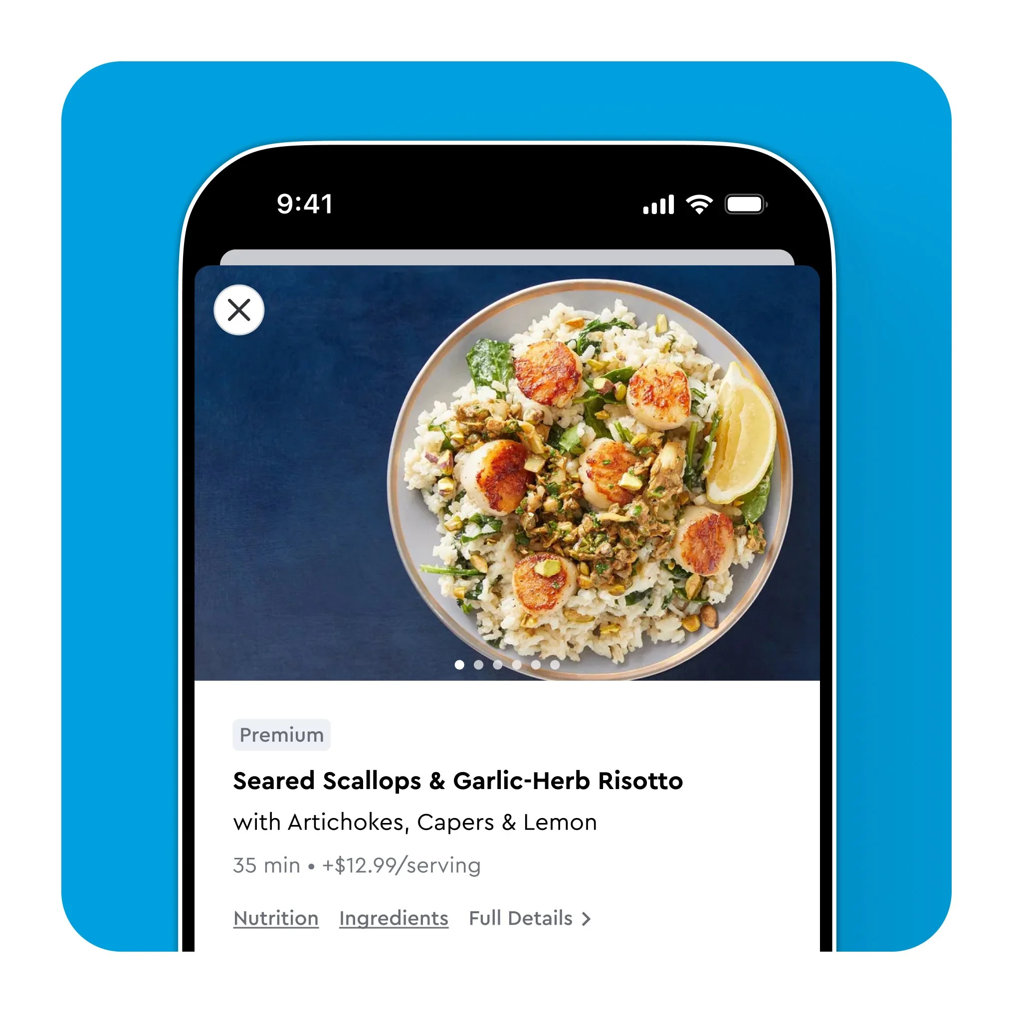
A redesigned ordering flow put craveworthy meal photos and key meal details front and center making meal selection easy and enticing.
Key meal details are now just a tap away greatly reducing the time and effort it takes to determine if a meal is a good match.
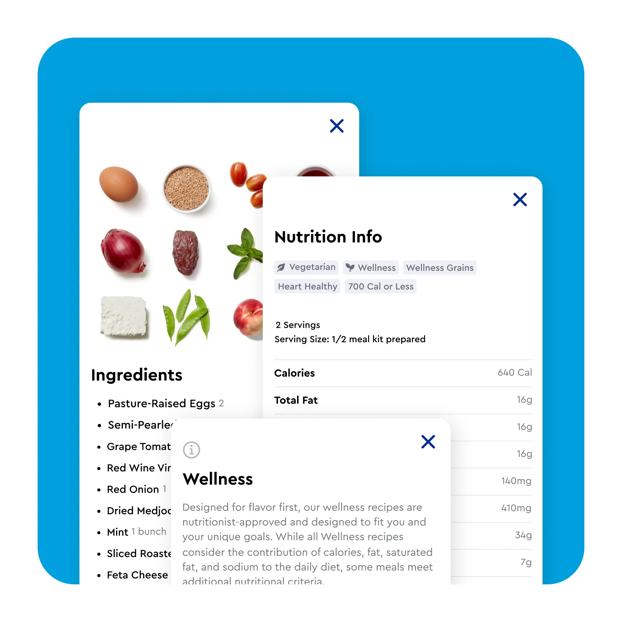
Launching recipe customization
Food is highly personal and everyone brings unique goals or restrictions to the table. Rolling out the ability to customize meals was exciting and a huge unlock for our customers allowing them more flexibility and control each week. We saw increased order rates especially with those with more restricted protein preferences as well as an increase in average order value.
Expanding menu options with add-ons
Blue Apron launched as a meal focused subscription but our customers kept asking for more and we delivered. With the launch of add-ons, we could finally offer our customers additional items they could add to their orders to make that week a little more special. While the selection was rather modest at launch, this portion of our menu expanded generously over time with new product lines and types giving us new ways to delight our customers while significantly increasing average order values.
Offering more control with scheduled deliveries
Food delivery comes with a ton of logistical hurdles behind the scenes, but for the customer, one of the biggest is knowing when their food will be delivered. For many, the uncertainty around picking a delivery date but having no control over the delivery time was a struggle. Launching the ability to select a two-hour delivery window was a major unlock for many customers giving them much more control. These forward thinking designs also allow for the ability to easily add a small fee for peak delivery times.
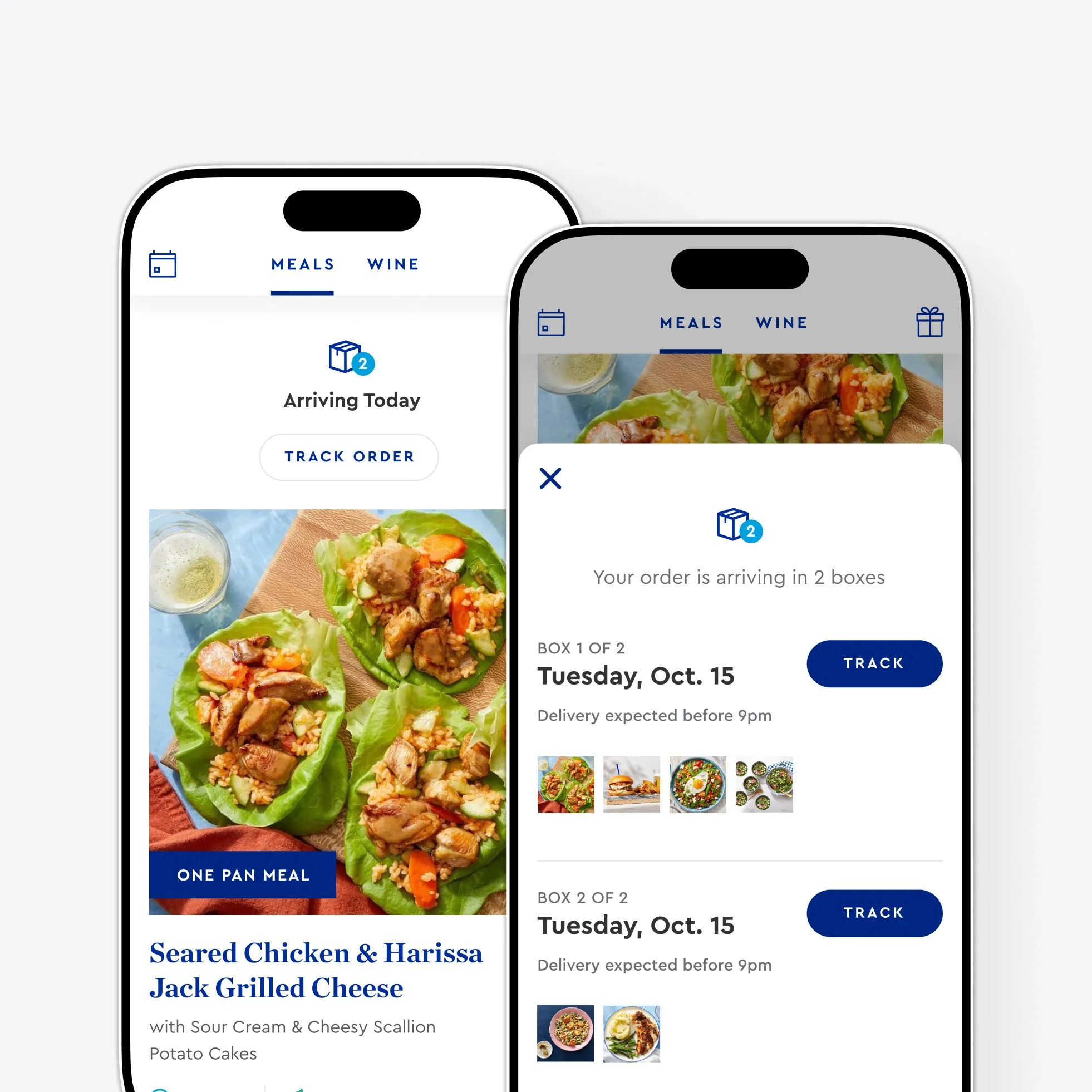
Enabling larger order sizes
For the longest time order sizes were limited by what could be packed in a single box. Once our dev-ops team unlocked the ability to split orders across multiple boxes, we could at long last let customers order as much food as they wanted leading to larger order sizes and order values.

Breaking down barriers to purchase
For years, we blocked our customers from ordering once they passed the cut-off for their originally scheduled order; even if we were still able to make a delivery later in the week. After recognizing this artificial restriction, I advocated for its removal and we saw a 1.3% reduction in skipped orders.

Encouraging additional ordering
For years a meal subscription meant only one order per week, but why limit users from ordering more? Rolling out the ability for users to place multiple orders in a single week was a major unlock for those who simply wanted more meals for their week or who wanted to gift meals to friends or family.
User Engagement
Engaged customers are your best customers. Building a relationship with customers focused around trust and value. Being welcomed into our customers’ homes week after week was an honor and one we knew we needed to earn.
Key KPIs: time spent on platform, feature usage, blog visits, marketplace visits & purchases, wine program conversion, push notification engagement, recipe rating, issue resolution time & satisfaction

A more engaging recipe browsing experience
As a valuable resource this new and improved design optimized for easier browsing and quick access to the recipes you’ve saved or already cooked for easy reference.
Providing value even on a week off
Skipping orders is a natural part of any weekly subscription and gave us an opportunity to be there for our customers even if one of our boxes wasn’t. We reshaped this moment of the customer journey into one that offered value to customers through engaging content and by surfacing other products they might be interested in.

Helping users manage their subscriptions
Weekly subscriptions are easy to lose track of which is where reminder notifications can really save the day and make the customer experience. The importance of this communication channel led to improvements and several iterations of the notification priming screen.

Automating issue resolution
With any service offering issues can arise and we wanted resolving those problems to be fast and easy. We built automated customer tools to allow for easier reporting of issues with immediate resolutions and no human interaction needed. These also gave us more accurate issue data logging, a 14% reduction in churn, and $250k annual savings in just the first phase with the opportunity for those savings to grow significantly.
An immersive cooking experience
While most customers preferred cooking with printed recipe cards, we had a passionate and vocal subset of customers who loved following our interactive instructions in the app and desperately wanted iPad support. We eventually gave the people what they wanted additionally throwing in a design refresh, a unified experience across platforms, and seamlessly integrating our social sharing camera feature and Apple Health/Google Fit at the end.
Behind the Scenes
There’s so much that goes into keeping both a product and design team functioning like a well oiled machine that customers never see. Efficient, well-run, productive teams don’t happen by accident
Modernizing our brand
Co-owner and key contributor to brand modernization initiatives across all user touchpoints with a specific focus on its implementation on all digital platforms and touchpoints.
Streamlining the design process
Defined, managed, and implemented a refreshed design system and component library following more modern design patterns for a better customer experience and stronger consistency across our digital platforms and touchpoints.
Creating consistency in visuals
As a design team the need for polished, clear, and consistent icons never ends. As a team we worked to update and rollout a refreshed icon style and additionally built out a subset of larger icons with both selected and deselected states for use in preference selection during sign up.
Listening to and advocating for customers
Conducted routine platform audits collecting, analyzing, and organizing user feedback as well as tracking key metrics such as NPS, task completion, and effort scores to track improvements over time. These findings were then distributed to relevant teams and referenced as a key resources in planning discussions as a tool to advocate for improvements and hold ourselves accountable to consistently improving the customer experience.

