Brooks Shoe Finder Redesign
Wondersauce
Role: User experience design
TEAM MEMBERS
Christopher Pross, Director
Erin Perez, Product Management
Lily Thalheimer, Product Management
Brandon Manheimer, User Experience
Ramon Barcenas, Visual Design
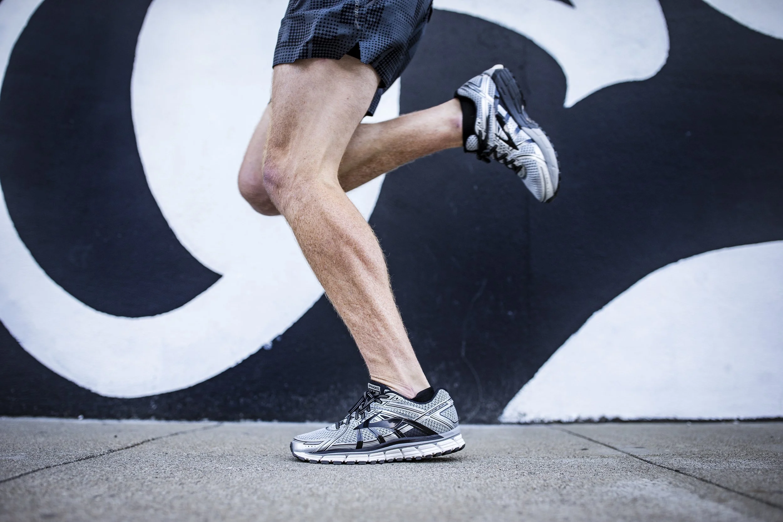
Brooks sells some of the best running gear in the world but with a wide product offering, users can need a little help finding which pair of shoes is best for them. Having just wrapped up the redesign of brooksrunning.com, Brooks asked us to help them reimagine and redesign their online shoe finder. Overarching goals were to sell more shoes, to increase the tool's usability, and to bring the tool visually in-line with the new Brooks site.
Each Brooks running shoe is designed to meet a specific physical need.
A perfect Brooks running shoe matches both a runner’s biomechanical needs and their personal preference for how they want their shoe to feel. Brooks calls this combination your “Run Signature”
Research
To help users find their perfect pair of shoes, we needed to better understand the product offering, how runners evaluate and select shoes, and what was and wasn't working with the existing shoe finder. We surveyed users, met with retail specialists, poured through site analytics, talked to their customer support team, and conducted stakeholder interviews and work sessions.
Our research quickly revealed that users were struggling to trust the tool and its recommendations.
It turns out users weren't convinced the shoe finder was a credible and scientifically based tool. Furthermore they weren't confident at times in their ability to answer some of the questions or why they were being asked. Educating the user throughout the process was going to be key.


Concept Exploration
To increase trust we needed to let the science behind the questions shine through but in a way that didn't alienate users. For this project we knew we wanted to explore and test a variety of unique concepts with actual runners. After plenty of brainstorming we selected three distinct directions and built out proof-of-concept prototypes for each.
How do we make the tool approachable while also showcasing its scientific foundation?
Concept 1: Conversation
A majority of specialty running shoe sales happen in-store where shopper's are able to speak directly with a running shoe specialist. In this direction we wanted to capture the familiar in-store conversational format to guide the shoe selection process.
Concept 2: Visual Guidance
Brooks’ shoe finder asks a user to complete exercises and answer questions about their body. This second direction captures this notion using rich visuals and an ever-present avatar to tie various questions to specific areas of the body.
Concept 3: In-home toolkit
Our moonshot direction imagined using your smartphone’s gyroscope and accelerometer to accurately measure and analyze your movement. Would people view a sensor based recommendation as being more trustworthy?
Usability Testing
During the project we conducted two rounds of usability testing recruiting a diverse group of runners in-line with the Brooks customer base for each. Our first round of testing informed our selection of the winning concept that we moved forward with. The second round helped us refine the content strategy, flow, and final designs for that direction.
Seeking out feedback from actual runners was critical in guiding our decision making throughout the project.
Twenty four runners of varying skills level participated in usability testing sessions joining us either remotely or in-person in our usability testing lab.
Designs
I've hand selected a few key moments in the user journey to highlight and explain strategic decisions that were made during the project. The following shows how the screens looked for our second round of usability testing just prior to my departure.
Transitional animations make the experience feel fluid and quick.
We added video demonstrations to help users complete the exercises and answer more confidently.
We introduced checkpoints to break up the lengthy series of questions and to reward users with results sooner.
Playful visuals and a darker color palette distinguish the tool from the rest of the site making it feel immersive and fun.
The final results screen feels impactful and prioritizes a top match followed by additional personalized recommendations. This moment carefully merges the playful visual aesthetic of the tool with that of the main ecommerce experience.