
BrooksRunning.com Refresh
Wondersauce
Role: User experience design
TEAM MEMBERS
Christopher Pross, Director
Erin Perez, Product Management
Dana Mulranen, Visual Design
Ramon Barcenas, Visual Design
Brooks is a performance running brand selling gear carefully crafted for runners, by runners. They are experts in running and running gear and were ready to become experts in e-commerce as well. We worked closely with their digital product, marketing, and development teams to launch a refreshed online store that lived up the reputation and unrivaled quality of their gear.
“Our mission is to deliver the very best running gear, so you can revel in the joy of running”
Getting to Know Runners
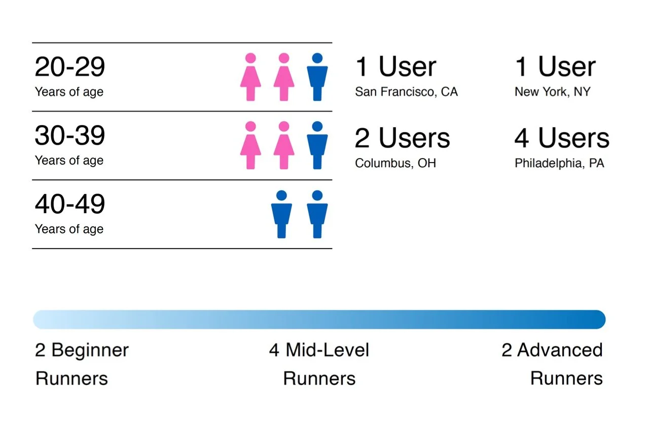
We kicked off the project by simply getting to know runners and trying to understand how they shop for running gear online. We selected and spoke with a diverse array of 8 runners across the United States with experience levels ranging from novice to ultra-marathon running. During these user interviews we also watched them interact with the legacy site trying to understand what was important to them along their shopping journey.

After getting to know this group of runners we developed a set of 4 key digital behavior patterns that kept surfacing in our interviews. We then used these patterns to guide the features, content, and design decisions we'd be making throughout the site refresh. It was important for us to remember that these were behavior patterns not personas, so one user could exhibit multiple and were not restricted to just one.
I developed the framework above to allow for quick and easy comparison across behavior types.
Keys to Success
Through our research we identified four things we'd need to create for the project to be successful:
Credibility - Brooks is the authority on running with the products and expertise to back it up.
Connection - The Brooks personality must be felt on every page of the site – building a personal connection and platform for the brand.
Confidence - Giving customers the confidence they need to shop online by overcoming as many of the physical barriers as possible.
Commerce - Creating organic opportunities to expose customers to Brooks products, across departments, while nailing e-commerce best practices.
Modular Design
Easy page creation, content flexibility, and reusability were project requests from the start leading us to follow atomic design principles for this project. To do this we worked hand-in-hand with both our internal developers and those at Brooks that would be building and maintaining the site. Together we built a pattern based system were individual components like buttons or text (atoms) could be combined together to form reusable clusters (molecules) and then arranged in various lock-ups to form reusable modules (organisms). Predetermined arrangements of these modules ultimately formed preset templates for various page types and use cases.
Easy page creation, content flexibility, and reusability were project requests from the start.
I owned the creation of a 103 page document outlining the rationale behind each page template and the module recommendations for each. The document outlines possible module variations for each page as well as outlining the purpose, rules, and different variations for each individual module itself.
Designs
The redesigned product detail pages let users easily shop and learn all about each product, its features, how others feel about it, and more.
New and updated shoe launches are a big deal for Brooks and their customers which led us to create special pre and post-launch pages. To the right, the events page builds excitement around upcoming races and helps runners find events to participate in.
While the original site navigation was sorted into men's and women's buckets, we opted to strategically surface products by equipment type. Highlighting these items in the primary navigation helps users identify that Brooks sells more than just shoes, driving sales and helping Brooks grow that part of their business.
Impact
Our updates to BrooksRunning.com were deployed in phases, and while we didn't touch many areas of the site, their impacts could be easily seen and felt.
+6%
increase in products added to cart
+4%
increase in sessions with checkout